
Guard Seeker Branding Project


![]()
![]()

 Task: Visual identity for Dossier
Usage: For Digital & screen
Year: 2018
“Guard Seeker was founded by people in the industry to create value within. Employers are able to streamline their recruitment by selecting the right people based on skills, education and experience. Employees are able to find their ideal job based upon location and skills required.”
Features
• Job portal for security guards.
• Finding the right candidate based on skills, education and experience.
• Find the right job without searching elsewhere.
• Search and create your own preference based on location and salary.
• Find new contacts and network with people in the industry

Brand Attributes
Moving forward with Researching and reading the details provided by Kevin (client). I filtered our the Brand attributes connected them with physical and personality aspects of the brand. presented to the client so that he can give his feedback to me or add something that was missioned out in mood board.

Mood Board

Concept behind mark
The mark is the combination of the letter G & S with an ellipse.

Sketches
After conception. moved forward with initial sketches on the paper-pencil. then moved that sketches in software and made then in grayscale with the help of Wacom tablet. then shared with the client. after getting feedback and chosen option. I moved forward with grinding.

Typography
Type is one of a success key element in a successful logo. So choosing the right type for the dossier is one of exciting of dossier identity design.

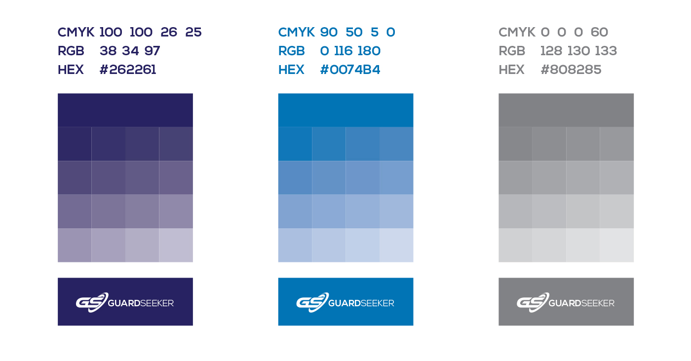
Colours
Shades blue colour shades symbolize trust, loyalty, wisdom, confidence, intelligence, faith, truth, and loyalty, trust. Blue is considered beneficial to the mind and body. It slows human metabolism and produces a calming effect. Blue is strongly associated with tranquillity and calmness.

Spacing Around Logo
GuardSeeker logo or mark only should be surrounded with clear space to ensure its visibility and impact. No graphic
elements of any kind should invade this zone.
Clear space is developed from the height of the 3 column grid box which is used to design the logo and is shown as “0.5x”.

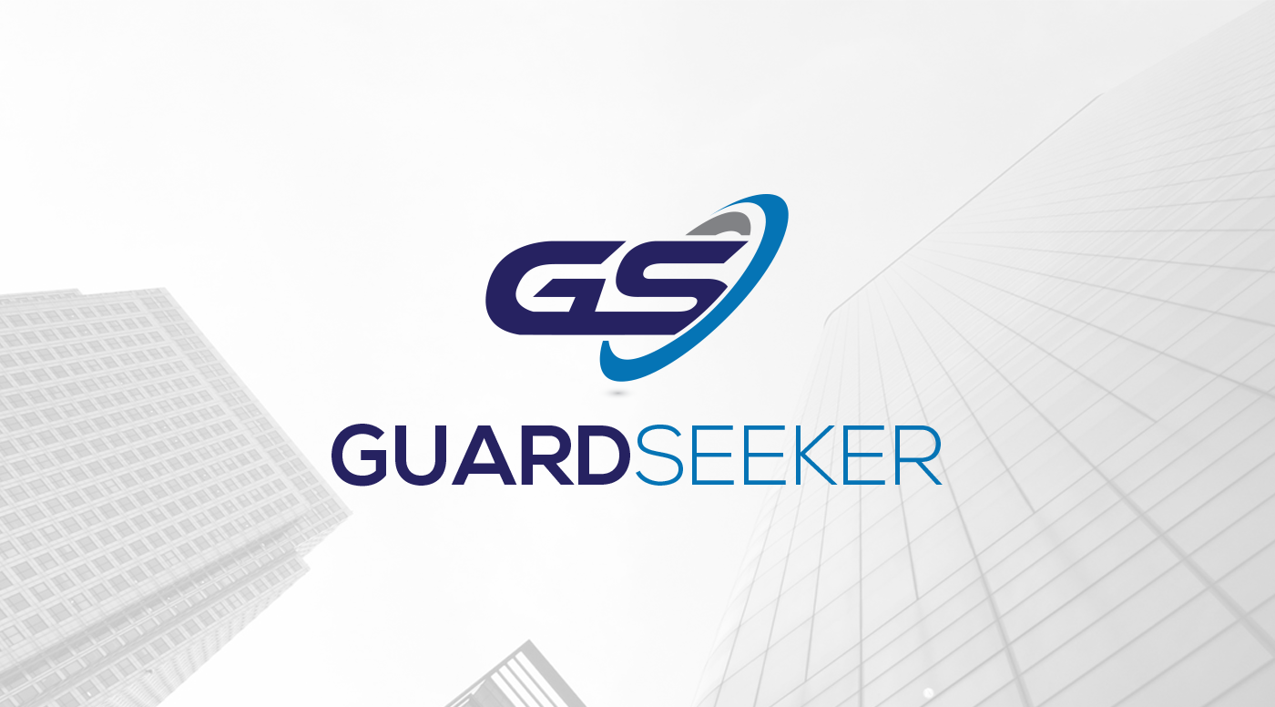
Final Logo
![]()
OS & Android app icon
![]()
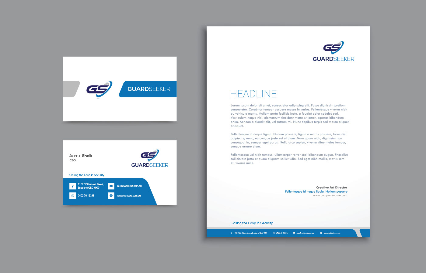
Stationaries


Corporate Flyer

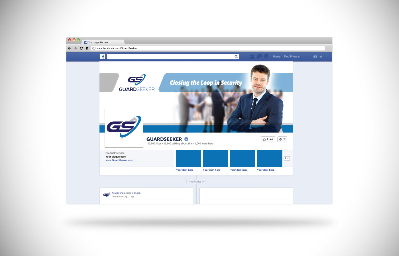
Facebook Page

Similar Projects

Branding identity | CASESTUDY | Editorial Design | Graphic Design | Logo Design
Creation Floralies Branding
View
Branding identity | CASESTUDY | Editorial Design | Graphic Design | Logo Design
French Guinguette Branding
View