
Branding identity | CASESTUDY | Editorial Design | Graphic Design | Logo Design

Task: Visual identity Packaging for ELIA
Usage: For Digital & screen
Year: 2018


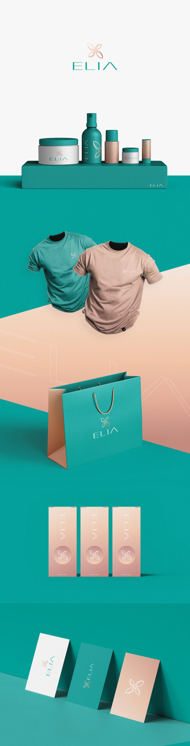
Elia is a new Swiss-based premium skincare tech brand that focusses on improving the lives of people naturally.
The Primary mission revolves around providing services for their clients in the space of health, longevity and increased performance in everyday life – Technology for better living, better living through science, Beauty-tech/health-tech, and the biohacking. The brand wanted to reflect this overall modern, healthy, longevity aspect in the look of a spa/beauty-tech salon that is not too feminine since a small part of their audience will be man as well.
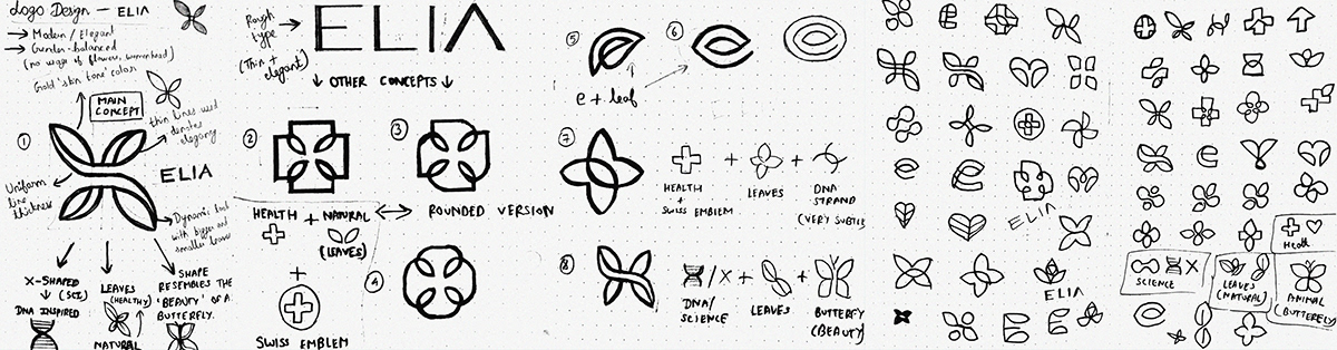
The main goal of this project was to develop a strong professional logo design that is simplistic, memorable as well as reflected a sense of luxury, authority, and high-end without seeming too unattainable.
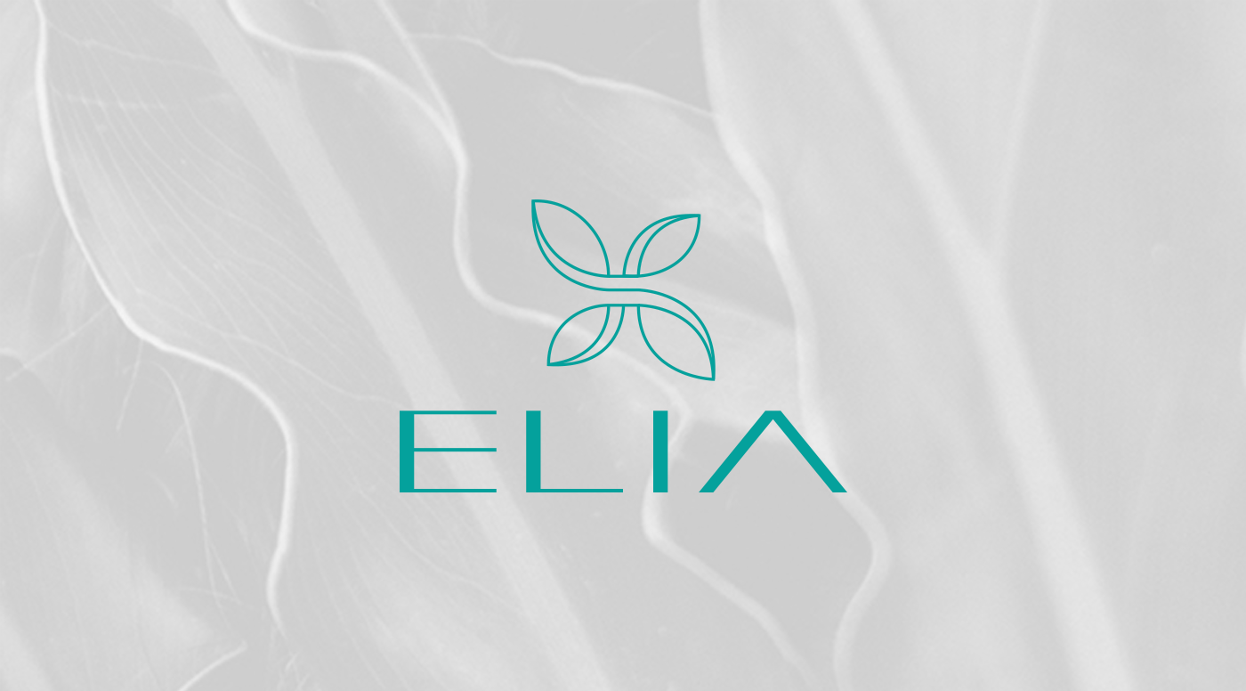
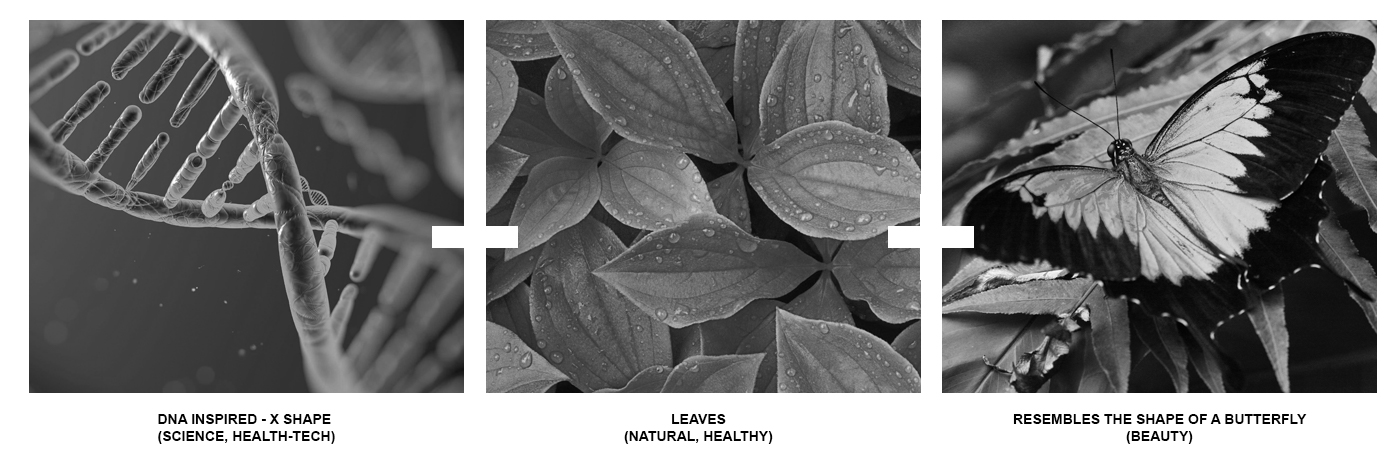
The final solution that was provided (after a lot of research, explorations and sketches) to help them stand out from the competition with the brand’s main symbol was basically a combination of a DNA strand inspired ‘X’ shape – indicating science/health-tech/bio-hacking. Leaves – representing their natural and healthy approach and a subtle butterfly inspired overall shape – symbolising beauty.
The rich and elegant ELIA type is designed completely from scratch and this further signifies the custom/tailor-made services that the brand wants to focus on with their clients instead of an assembly line of services that is the same for everybody.
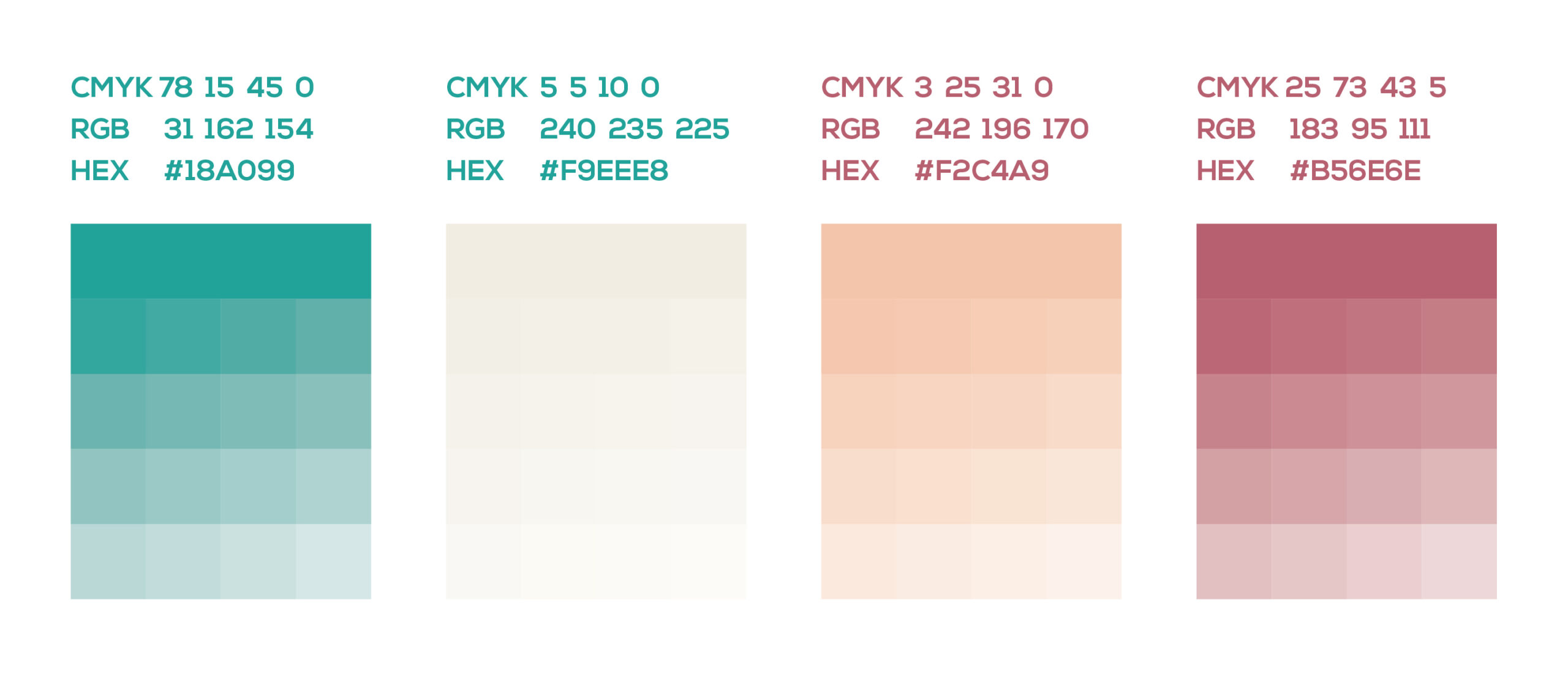
Being a premium brand, the colors had to be chosen with great attention. Teal/Turquoise color usually denotes balance, healing, calmness, nature, and, suits well with the scientific/health-orianted aspect of the company. This in combination with a warm ‘skin-tone’ gradient color rightly fits the brand like a glove.


