
Delivery Pro
Delivery Pro
Dashboard web app for a growing logistics company that offers digital warehousing solutions
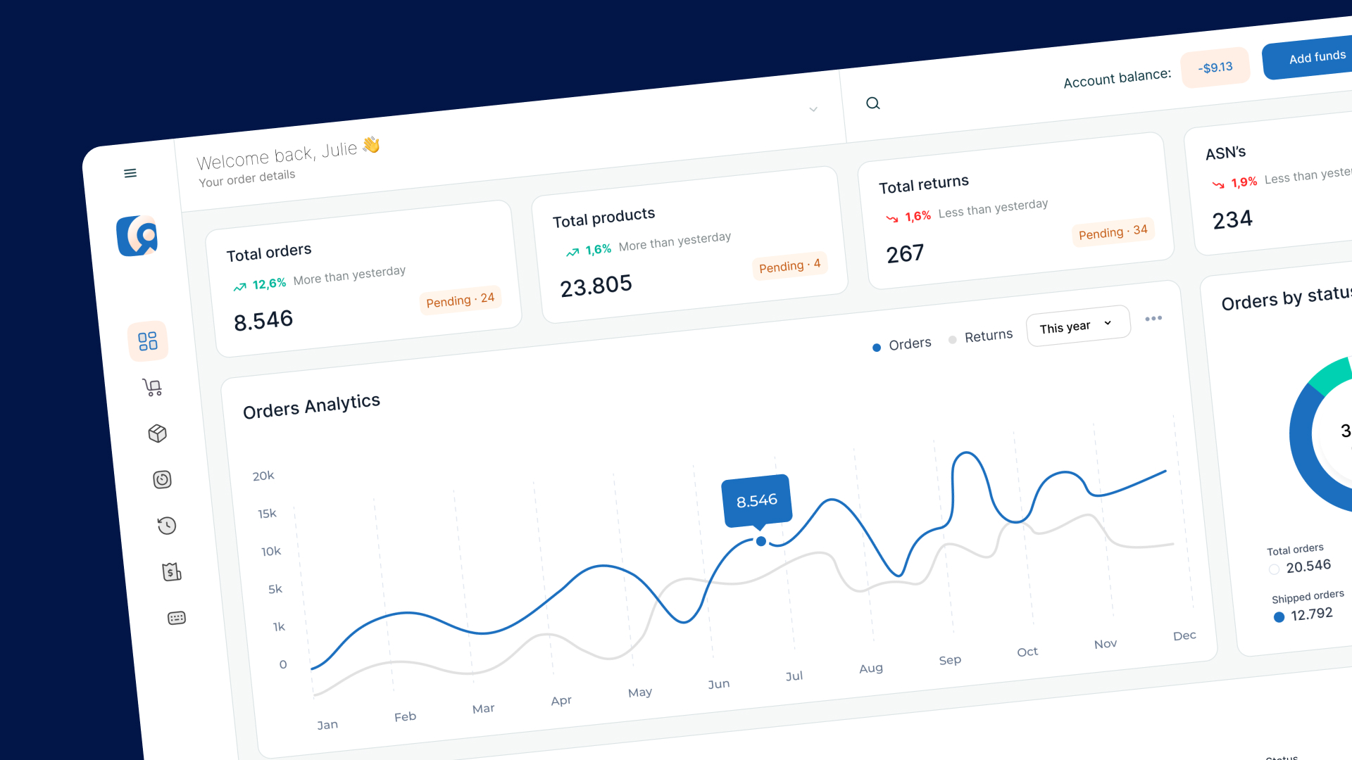
Delivery Pro
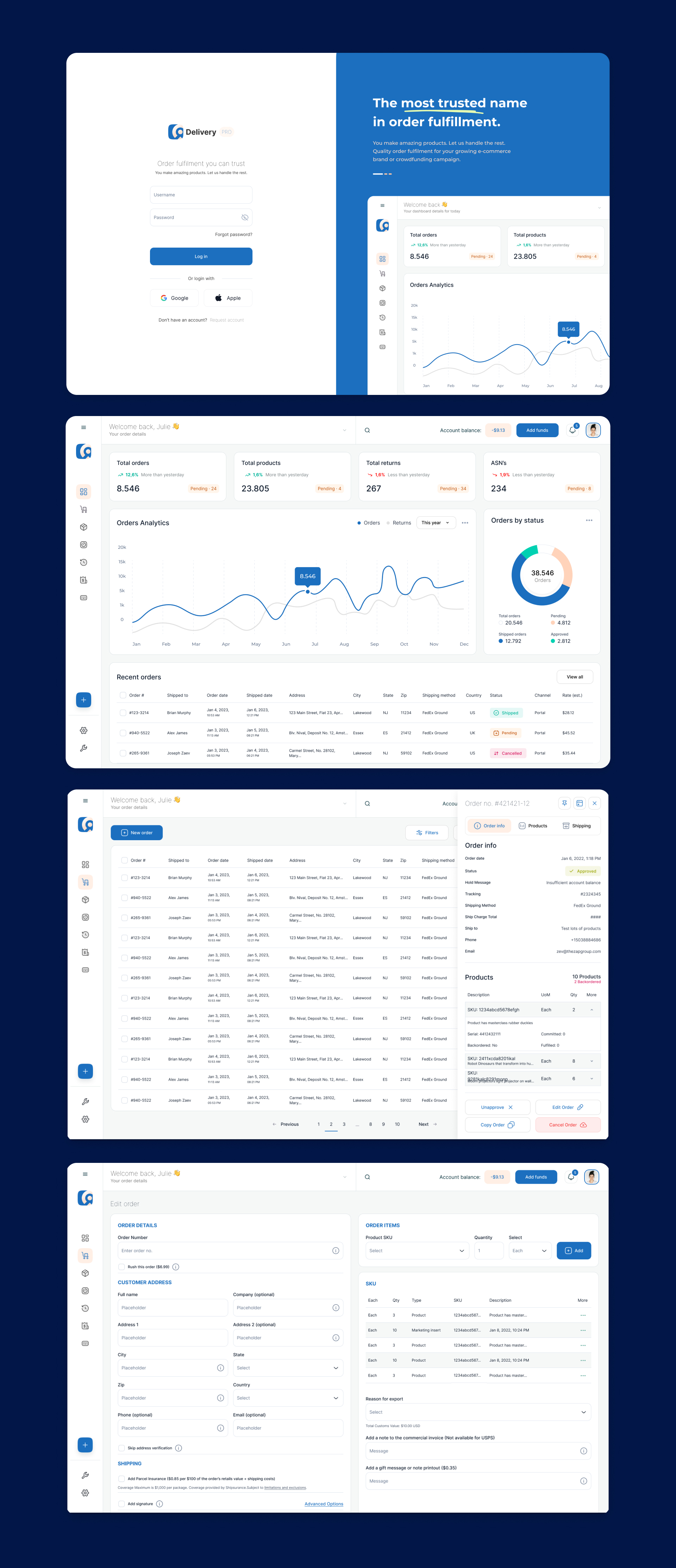
Delivery PRO is a dashboard app that enables easy warehousing solutions and powerful integrations with your online shopping cart to fast packing and shipping. The all-in-one order fulfilment platform lets you scale your business and delight your customers with a logistics partner that feels like an extension of your team.
Challenge
The platform was losing existing customers and failed to convert new paying users. They were losing in the favour of other platforms that looked more modern and were optimized for the user experience of the ideal customer. Design and their approach to design was key metric that directly impacted the net revenue of the company.
Solution
The key to successfully redesigning a logistics dashboard is to keep the user’s needs front and centre throughout the design process. When redesigning the dashboard, we’ve started with understanding the needs of our ideal user. We gathered information about the user’s goals, tasks, and pain points. This information helped us to create a design that is tailored to the user’s needs.
The next step was to analyze the current design of the logistics dashboard. We identified the strengths and weaknesses of the current design and determine which aspects need to be improved. This helped us to create a design that builds on what already works well and addresses any pain points. Based on your research and analysis, we created a user-centered design that is intuitive and easy to use.
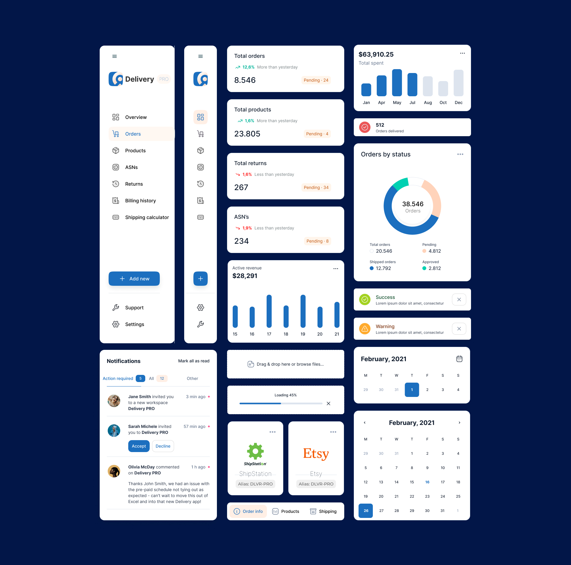
The dashboard was designed in a way that makes it easy for users to find the information they need quickly. To achieve this, we created a visual hierarchy that prioritizes the most important information and makes it easy to scan the dashboard for relevant data. The logistics dashboard will likely display a lot of data, so it’s important to use appropriate data visualization techniques to make the information easy to understand. We have chosen the right charts, graphs, and other visualizations that clearly communicate the data.
Once we’ve created the design, we’ve used an interactive prototype to test it with users to ensure that it meets their needs and expectations. Based on user feedback, we iterated the design and made improvements as needed.


Similar Projects